Welcome to a new feature on Rebecca Reads: Covering the Classics. In this feature, I look at the different ways a classic novel has been covered for publication.
I decided to start with one of my favorite books, To Kill a Mockingbird by Harper Lee. I recently finished rereading it, so the story is fresh in my mind, and I also was interested in seeing how it was presented in the past.


- Which of these covers do you like?
- Which do you dislike?
- If you’ve read the book, which cover(s) do you think best represent the text?
- If you haven’t read the book, which would most likely prompt you to pick it up?
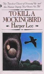
Personally, I am partial to the original cover, which was recently reissued for the fiftieth anniversary of publication. I also like the more recent silhouette covers, which seem to capture childhood (the tire swing does that well, I think).
Do you have a book you’d like to see featured on “Covering the Classics”? Send me a note or leave a comment below.

What a great feature!
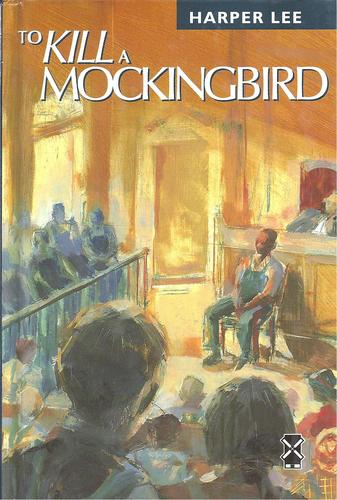
I think my favourite is the one from 1966 New Windmills. I like the court room scene.
I like the original and the 2010 Arrow and Popular Library ones. In fact, they’ve tempted me to get myself a duplicate copy several times before!
I have the 2nd one, which is a truly unfortunate cover; I got it from a thrift store when I was 11 though! Eventually, I’ll treat myself to a new edition; I love the original and the three black-and-white line drawing ones. 🙂
I have the first one! I got it in hardback for a dollar at my library book sale and I adore it. The orange one is kind of cool too though — I’m not crazy about orange but if I ever needed to color-code my books, it’d be nice to have a few orange ones. 🙂
Great feature idea!! I kinda like 2nd row, fourth column, because I like seeing the face of the character. I like the courtroom one, too. (Apparently I like pictures.) 🙂
My favorite is probably the 2010 Popular Library mass market one. (Though the one next to it–the one with the tire swing looks great too!
I would love to have you feature Gone with the Wind or The Lion The Witch and the Wardrobe!
Neat feature! I like the first one and the third one, third row. I didn’t even see the tire swing until you mentioned it.
I found a copy published in 1960 and altho it didn’t say “first edition”, I was convinced it would be worth more than the 25 cents I paid. But alas, no. oh well! I’m still quite pleased to own it.
I think my personal favorites are the second and third from the left on the very last row. I have a thing for black and white covers, artistically done. Thanks for putting this together. I love to see all of the different choices from over the years.
Pam (@iwriteinbooks) » I like the black and white covers too! Glad you like the feature.